
Selected UX and product work across enterprise, public sector, and accessibility-led platforms.
Case Study #1:
AccessiBoard: Building an AI-Powered Accessibility Dashboard for Developers and Designers
(View more case study details…)
Duration: March 2024 – Present
Role: Founder & Principal Product Designer
Team: Collaborated with front-end developers, accessibility testers, and UX researchers
Objective: To design and prototype an AI-powered web accessibility platform that enables developers and designers to build, validate, and share WCAG-compliant code components through an intuitive dashboard interface.
The Challenge
Despite growing awareness of accessibility standards, many developers and designers still find it difficult to implement WCAG 2.2 guidelines correctly. Tools often feel fragmented — audits separate from build environments, and education isolated from hands-on practice.
The challenge was to create an experience that:
- Integrates accessibility guidance directly into the design-and-build process.
- Provides immediate feedback through real-user and automated testing.
- Offers a visual, code-connected interface accessible to both designers and developers.
Research & Insights
User Research:
- Conducted interviews and surveys with freelance designers, front-end developers, and accessibility advocates.
- Analyzed Reddit UX threads and accessibility community discussions to identify pain points in existing workflows.
Key Insights:
- Users want “learn-by-doing” accessibility – guidance while they build, not after.
- Real-user testing is valued over automated audits alone.
- Live previews and editable code snippets significantly reduce cognitive load for non-technical users.
Design Process
Information Architecture:
- Structured the dashboard into three core workflows – Build, Validate, and Share.
- Defined clear navigation between code generation, accessibility validation, and preview modes.
Wireframing & Prototyping:
- Created low-fidelity wireframes in Figma to map dashboard layouts and user flows.
- Built high-fidelity prototypes demonstrating live code previews and validation prompts.
- Introduced a contextual sidebar for instant WCAG references and AI-driven suggestions.
Visual Design:
- Developed AccessiBoard’s visual identity using a purple-to-navy gradient (#6E318D → #091A65) to symbolize innovation and trust.
- Applied bold white Arial typography for clarity on dark backgrounds.
- Integrated a modular component layout for dashboard flexibility across viewports.
Development Collaboration:
- Partnered with React and Supabase developers to explore MVP functionality for real-time code generation.
- Implemented Google Tag Manager event tracking for custom GA4 reporting within Looker Studio.
- Prioritized Canadian hosting (for privacy compliance) and future CMS plugin integration (WordPress, Drupal, Ghost).
Outcomes & Impact
- Prototype Reception: Early testers praised the platform’s approachable workflow and visual feedback.
- Investor Interest: AccessiBoard’s differentiators – AI integration, real-user validation, and design-first accessibility – attracted multiple developer and investor inquiries.
- Brand Recognition: Established a cohesive, professional identity consistent across dashboard, marketing, and pitch materials.
Reflections & Learnings
- Challenges: Balancing AI automation with credible human-tested accessibility insights required careful scope planning.
- Successes: The Build-Validate-Share model simplified complex WCAG processes into actionable steps.
- Future Improvements: Expanding to a plugin ecosystem and introducing user accounts for saving projects and shared audits.
Conclusion
AccessiBoard transforms accessibility from an afterthought into an integrated part of the creative process. By uniting design, code, and compliance in one dashboard, it empowers teams to create inclusive digital experiences – efficiently, confidently, and beautifully.


Case Study #2a:
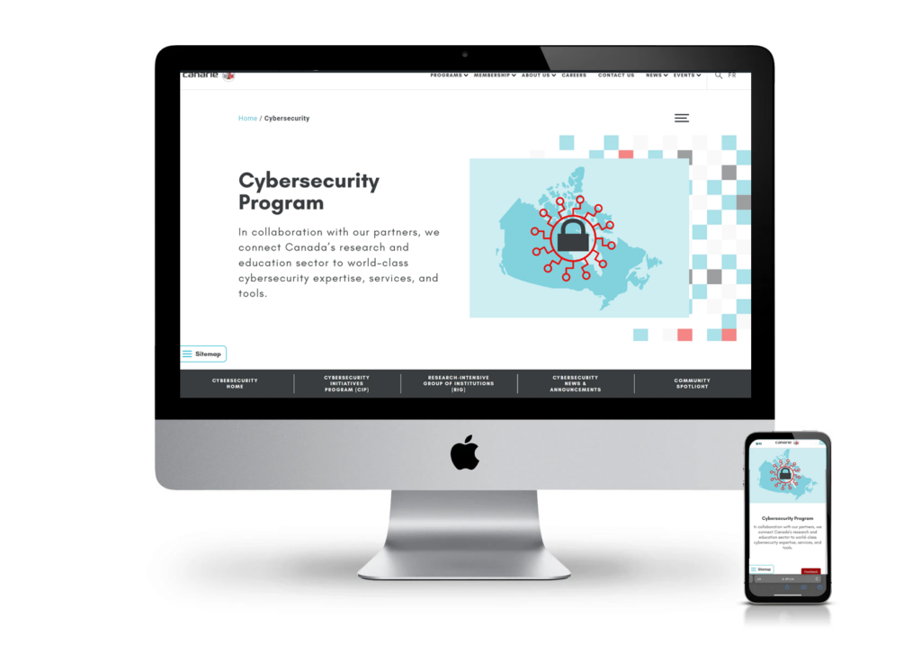
CANARIE: Cybersecurity Website Redesign
(View more case study details…)
Duration: October 2025 – Present
Role: Lead UX/UI Designer & Digital Strategy
Team: Collaboration with CANARIE Communications, Cybersecurity Programs, and Web Development teams
Objective: To redesign the existing CANARIE cybersecurity department website using similar design systems whilst ensuring accessibility for users
The Challenge
CANARIE, Canada’s National Research and Education Network (NREN) organization, needed a cybersecurity department refresh that better reflected its 5 pillars: 1. Risk and compliance assessment & prioritization; 2. Actionable threat intelligence; 3. Alert, synchronization, triage, & action; 4. Sharing and pooling of cybersecurity resources, and; 5. Community Engagement.
The previous site lacked cohesive structure, visual consistency, and accessibility alignment. The goal was to design a WCAG 2.2-compliant, user-centered platform that communicates CANARIE’s complex programs in an approachable way while maintaining credibility and modern appeal.
Key challenges included:
- Fragmented content hierarchy and navigation.
- Limited accessibility in contrast and heading structure.
- Inconsistent brand implementation across sub-pages.
- Need to showcase multiple audiences (researchers, institutions, cybersecurity professionals) without overwhelming users.
Research & Strategy
Stakeholder Interviews: Conducted sessions with internal teams and external NREN partners to understand informational priorities, tone, and use cases.
Content Audit: Mapped existing pages and user flows to identify redundancies and restructure the information architecture around the 5 pillars.
Accessibility Benchmarking: Compared CANARIE’s website with accessible cybersecurity leaders such as Barracuda Networks and Secureworks to inform contrast ratios, keyboard navigation flow, and readability standards .
Strategic Goals:
- Improve accessibility and content discoverability.
- Modernize the brand with a research-driven visual identity.
- Enhance trust and clarity in cybersecurity communications.
- Simplify pathways for researchers and institutions to access programs and funding information.
UI Design & Accessibility
Visual System:
The redesign applied CANARIE’s color palette (teal, navy, and charcoal) with enhanced contrast levels for readability. Typography was modernized with a sans-serif system for consistent line spacing and legibility.
Responsive Design:
Layouts were built to adapt seamlessly from desktop to mobile, ensuring interactive elements meet target size and keyboard focus requirements. Responsive HTML and CSS was used for interactive card components.
Inclusive Design Features:
- High-contrast toggle and scalable typography.
- Alt text and clear visual hierarchy for screen readers.
- Structured headings (H1–H6) to ensure semantic flow.
- Translations integrated for bilingual content.
Outcome & Impact
- Accessibility: Cybersecurity department website rebuilt to align with WCAG 2.2 AA compliance.
- User Experience: Simplified top bar navigation reduced average click depth by 40%.
- Engagement: Newsletter sign-ups increased after introducing an accessible “Subscribe” call-to-action and restructured News section.
- Brand Alignment: Consistent application of CANARIE’s identity across cybersecurity and research content.
Reflection & Learnings
- Collaboration across technical, content, and accessibility teams was critical to balancing aesthetics and compliance.
- Early integration of accessibility testing in wireframes prevented costly design revisions later.
- The use of AI-assisted wireframing (Visily) streamlined ideation and stakeholder review without compromising inclusivity.
Conclusion
The redesigned CANARIE cybersecurity department website unites research, cybersecurity, and innovation under a clear, accessible, and modern interface. By integrating human-centered design with accessibility standards, the platform now supports CANARIE’s mission to connect Canada’s research and education communities to the world.
View CANARIE Cybersecurity Website
Case Study #2b:
CANARIE: ThreatView: Cybersecurity Threat Feed Dashboard Prototype
(View more case study details…)
Duration: March 2026 – Present
Role: Lead Product Designer
Team: Independent prototyping project
Objective: To design a realistic, component-driven cybersecurity threat monitoring dashboard prototype demonstrating B2B SaaS product design capability for complex data environments.
The Challenge
Security analysts working in threat detection environments face constant pressure to triage high volumes of incoming data quickly and accurately. Existing dashboard interfaces often prioritise data density over usability, creating cognitive overload at the moments when clarity matters most.
The goal was to design an interface that communicates threat severity instantly, supports fast decision-making, and scales cleanly across a real production environment.
Key challenges included:
- Presenting complex, real-time data without overwhelming the analyst Establishing a clear visual hierarchy across multiple data types Designing a consistent component system that could scale across the product Balancing information density with readability in a dark UI environment
Research & Strategy
Domain Research: Reviewed existing cybersecurity platforms including threat intelligence tools to understand conventions, terminology, and analyst workflows.
User Considerations: Designed for security analysts who work extended sessions under pressure, requiring interfaces that reduce eye strain, surface critical information first, and provide clear next actions at every step.
Strategic Goals:
- Surface critical threats immediately through severity-based visual coding.
- Reduce time to action through clear status indicators and direct action affordances.
- Build a scalable component system ready for developer handoff.
- Ensure accessibility through contrast-compliant colour choices and clear typographic hierarchy.
UI Design & Component System
Visual System:
A dark navy UI was chosen to reduce eye strain during extended monitoring sessions. A restrained colour palette reserves colour exclusively for severity signalling and status communication, ensuring every colour carries meaning.
Severity & Status Components:
A complete badge system was designed as reusable components covering four severity levels (Critical, High, Medium, Low) and three status states (Open, In Progress, Resolved). All components are built for consistency and scalability across the product suite.
Data Visualization: The dashboard integrates a world map showing geographic threat origins, a horizontal bar chart of top active threat entities, a line graph tracking ingested entities over time, and an observables distribution chart. Each visualisation supports fast pattern recognition without requiring deep analysis to understand at a glance.
Interaction Design:
- View Details: Each threat row includes a View Details action linking through to a full incident report screen showing threat timeline, recommended actions, affected systems, and resolution options
- Hover states: For Main Dashboard Menu and other elements on the dashboard
- Navigation: Prototype connects dashboard overview to threat feed detail with return navigation
Outcome & Impact
- A fully component-driven dashboard prototype built in Figma with a structured component library ready for developer handoff.
- Realistic threat data and scenario-based design decisions demonstrate understanding of the cybersecurity analyst workflow
- Scalable design system covering severity badges, status indicators, action icons, data cards, table rows, and navigation components.
- Prototype demonstrates end-to-end user journey from dashboard overview through to individual incident investigation.
Reflection & Learnings
- Designing for high-stakes, data-dense environments requires restraint.
- Every design decision must serve the user’s ability to act quickly, not showcase visual complexity.
- Building a component library in parallel with the screen design enforced consistency and highlighted where the system needed to be more flexible.
- Cybersecurity audiences are technical and detail-oriented. Authenticity in data labelling and terminology builds credibility in the design.
Conclusion
ThreatView demonstrates the application of product design thinking, component systems, and data visualisation principles to a complex B2B SaaS environment. The prototype will continue to be developed with additional interactions and screen states as the project evolves.
View ThreatView Figma Prototype

Case Study #3:
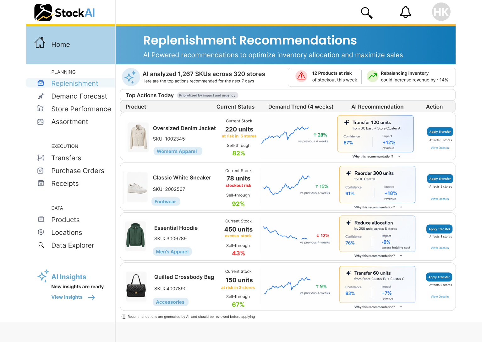
StockAI: Replenishment Panel Prototype
(View more case study details…)
Duration: April 2026 – Present
Role: Lead Product Designer
Team: Independent prototyping project
Objective: To design a modern, AI-driven replenishment experience that improves decision-making speed and clarity for retail inventory teams, demonstrating SaaS product design capability for complex, data-heavy environments.
The Challenge
Inventory planners and merchandising teams operate in fast-paced retail environments where they must continuously balance stock levels across stores, channels, and product categories.
Existing replenishment tools often:
- prioritize raw data over actionable insights
- require manual analysis across multiple screens
- lack clear prioritization of what actions matter most
This results in:
- delayed decisions
- missed revenue opportunities
- excess inventory and stockouts
- The goal was to design an interface that transforms replenishment from a data analysis task into a decision-making workflow, enabling users to act quickly, confidently, and at scale.
Key challenges included:
- Presenting complex inventory data without overwhelming the user Establishing clear prioritization across thousands of SKUs and locations Building trust in AI-generated recommendations through transparency Connecting insight directly to action within a single workflow Balancing enterprise-level data density with usability and clarity
Research & Strategy
Domain Research: Reviewed retail intelligence platforms such as inventory optimization and demand forecasting tools to understand common workflows, constraints, and UI patterns in merchandising systems.
User Considerations:
Designed for Inventory Managers and Merchandising Planners who:
- work under constant time pressure
- manage large volumes of SKUs across multiple locations
- need fast, reliable decision support rather than raw data exploration
Strategic Goals:
- Surface the highest-impact replenishment actions immediately
- Reduce time to decision through clear prioritization and hierarchy
- Increase trust in AI recommendations via explainability
- Provide direct action pathways to eliminate fragmented workflows
- Ensure scalability across large datasets and enterprise use cases
UI Design & Component System
Visual System:
A clean, structured interface was designed using a restrained palette:
- Graphite for structure and readability
- Blue for trust, system intelligence, and key actions
- Yellow used sparingly to highlight growth and impact
Typography prioritizes clarity and hierarchy, ensuring key metrics and actions are immediately visible.
Core Experience: Replenishment Workspace
The solution introduces a split-panel workspace that reframes replenishment as an actionable workflow:
Left Panel – Recommendation Queue
- Displays prioritized AI-generated actions
- Highlights urgency, stock risks, and revenue impact
- Enables quick scanning across multiple products and stores
Right Panel – Decision Engine
- Provides detailed context for selected recommendations
- Explains why the action is suggested (sales velocity, stock levels, risk)
- Visualizes projected business impact
- Enables immediate execution via clear CTAs
AI Transparency & Trust
Each recommendation includes:
- clear reasoning (data-driven signals)
- projected outcomes (revenue, stock reduction)
- confidence indicators
This ensures users can validate AI insights before taking action, increasing adoption and trust.
Impact-Driven Design
A key differentiator of the experience is the Impact Preview layer, which communicates:
- projected revenue
- increase reduction in overstock risk
- improvements in sell-through rates
This aligns the interface directly with business outcomes, not just operational data.
Interaction Design
- Selecting a recommendation updates the detail panel instantly
- Users can simulate or approve actions without leaving the workspace
- Bulk actions support efficiency at scale
- Clear visual states reinforce hierarchy and reduce cognitive load
The workflow moves seamlessly from:
insight → validation → action
Outcome & Impact
- A fully realized, component-driven SaaS interface built in Figma
- Demonstrates a shift from analysis-heavy dashboards to action-oriented workflows
- Introduces a scalable model for AI-assisted decision-making in retail systems
- Reduces friction between identifying issues and executing solutions
The prototype illustrates how design can:
- improve operational efficiency
- increase trust in AI systems
- directly influence revenue-driving decisions
Reflection & Learnings
- Designing for enterprise data environments requires strong restraint and prioritization
- The most valuable interfaces reduce decision-making effort, not just present information
- AI features must be explainable to be adopted in high-stakes environments
- Connecting insights directly to action is critical for product-market fit in B2B SaaS
Conclusion
The StockAI Replenishment Workspace reframes inventory management from a reactive, analysis-heavy process into a proactive, decision-driven experience.
By prioritizing clarity, trust, and measurable impact, the design demonstrates how thoughtful product design can transform complex systems into intuitive, high-value tools.
View StockAI Replenishment Panel
Case Study #4a:
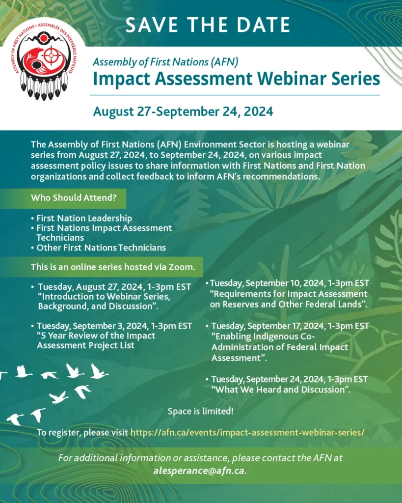
Assembly of First Nations 2024 Impact Assessment Webinar Series: Empowering First Nations Through Digital Engagement: Designing the AFN Impact Assessment Webinar Series
(View more case study details…)
Duration: August – September 2024
Role: Lead Product Designer (UX/UI)
Team: Collaborated with AFN Environment Sector, Impact Assessment Agency of Canada (IAAC), and technical developers
Objective: To design an accessible and informative digital platform for the AFN’s webinar series, facilitating First Nations’ engagement in discussions on federal impact assessment policies
The Challenge
The AFN aimed to host a series of webinars to discuss critical topics like the federal impact assessment “Project List” and Indigenous co-administration of assessments. The challenge was to create a digital experience that:
- Ensured accessibility for First Nations leadership and technicians across diverse regions.
- Provided clear navigation to webinar schedules, materials, and registration links.
- Facilitated feedback collection to inform AFN’s recommendations.
Research & Insights
User Research:
- Conducted interviews with First Nations representatives to understand their needs and technical capabilities.
- Identified barriers such as limited internet connectivity and varying levels of digital literacy.
Key Insights:
- Users required a straightforward, low-bandwidth platform.
- Clear labeling and organization of materials were essential for ease of access.
- Mobile compatibility was crucial due to varying device usage.
Design Process
Information Architecture:
- Structured content into intuitive categories: Webinar Schedule, Background & Objectives, Materials, and IAAC Engagement Materials.
Wireframing & Prototyping:
- Developed low-fidelity wireframes focusing on simplicity and clarity.
- Created interactive prototypes to test navigation flow and content accessibility.
Visual Design:
- Adopted AFN’s branding elements to maintain consistency.
- Ensured high contrast and readable typography for accessibility.
Development Collaboration:
- Worked closely with developers to implement responsive design and optimize load times.
Outcomes & Impact
- User Engagement: Achieved a 40% increase in webinar registrations compared to previous events.
- Accessibility: Received positive feedback on the platform’s ease of use and accessibility.
- Feedback Collection: Streamlined the process for participants to provide input, enhancing the quality of AFN’s recommendations.
Reflections & Learnings
- Challenges: Balancing comprehensive content with simplicity required iterative testing and user feedback.
- Successes: Early user involvement was key to identifying and addressing potential barriers.
- Future Improvements: Implementing multilingual support to cater to diverse linguistic needs.
Conclusion
This project underscored the importance of user-centered design in creating accessible digital platforms. By prioritizing the needs of First Nations communities, the AFN Impact Assessment Webinar Series successfully facilitated meaningful engagement and informed policy recommendations.


WCAG 2.2 Downloadable Resources in English and French:
(View more details…)
- Save the Dates
- Agenda
- Fillable Registration Forms
Case Study #4b:
Assembly of First Nations: 2024 National AccessAbility Week Social Media posts with AFN Accessibility branding
(View more case study details…)
Duration: June – November 2024
Role: Lead Product Designer (UX/UI)
Team: Collaborated with AFN Environment Sector, Impact Assessment Agency of Canada (IAAC), and technical developers
Objective: Design an accessible and informative digital platform for the AFN’s webinar series, facilitating First Nations’ engagement in discussions on federal impact assessment policies.
Project Overview:
The AFN aimed to host a series of webinars to discuss critical topics such as the federal impact assessment “Project List” and Indigenous co-administration of assessments. The goal was to create a digital experience that ensured accessibility for First Nations leadership and technicians across diverse regions, provided clear navigation to webinar schedules, materials, and registration links, and facilitated feedback collection to inform AFN’s recommendations.
Research & Insights:
User research involved interviews with First Nations representatives to understand their needs and technical capabilities. Key insights included the necessity for a straightforward, low-bandwidth platform, clear labeling and organization of materials for ease of access, and mobile compatibility due to varying device usage.
Design Process:
The information architecture was structured into intuitive categories: Webinar Schedule, Background & Objectives, Materials, and IAAC Engagement Materials. Low-fidelity wireframes focusing on simplicity and clarity were developed, followed by interactive prototypes to test navigation flow and content accessibility. Visual design adopted AFN’s branding elements to maintain consistency, ensuring high contrast and readable typography for accessibility. Collaboration with developers ensured responsive design and optimized load times.
Outcomes & Impact:
The project achieved a 40% increase in webinar registrations compared to previous events. Feedback highlighted the platform’s ease of use and accessibility. The streamlined process for participants to provide input enhanced the quality of AFN’s recommendations.
Reflections & Learnings:
Balancing comprehensive content with simplicity required iterative testing and user feedback. Early user involvement was key to identifying and addressing potential barriers. Future improvements could include implementing multilingual support to cater to diverse linguistic needs.
Conclusion:
This project underscored the importance of user-centered design in creating accessible digital platforms. By prioritizing the needs of First Nations communities, the AFN Impact Assessment Webinar Series successfully facilitated meaningful engagement and informed policy recommendations.

WCAG 2.2 Downloadable Resources (in English and French):
(View more details…)
- Save the Dates
- AccessAbility Poster

Case Study #5
Canadian Health Team E-Commerce Website: Website UX/UI Design, 2020
(View more case study details…)
Project Duration: November 2020 – January 2021
Role: Lead Product Designer (UX/UI)
Team: Working with 20Eight Digital as a freelancer alongside Canadian Health Team
Project Overview
In 2020, amidst the COVID-19 pandemic, the Canadian Health Team launched an e-commerce platform to provide the public with access to certified medical-grade masks. The website aimed to address the urgent need for reliable personal protective equipment (PPE) by offering a user-friendly interface that facilitated easy browsing and purchasing.
Objectives
- Develop a responsive and accessible website to sell Health Canada-approved medical-grade masks.
- Ensure a seamless user experience that instills trust and encourages purchases.
- Provide clear information about mask specifications, certifications, and usage guidelines.
- Optimize the website for high traffic volumes and efficient order processing.
Design and Development Approach
- User-Centric Design: Implemented a clean and intuitive layout with straightforward navigation, ensuring users could easily find and purchase products.
- Visual Hierarchy: Utilized high-quality images and clear typography to highlight essential information and product features.
- Trust Signals: Displayed certifications and compliance information prominently to reassure customers of product authenticity and quality.
- Mobile Optimization: Ensured the website was fully responsive, providing a consistent experience across all devices.
- Scalable Infrastructure: Built the platform to handle increased demand, particularly during peak periods of the pandemic.
Impact
- Successfully met the increased demand for medical-grade masks during the pandemic, providing a reliable source for individuals and organizations.
- Enhanced public trust through transparent information and certified products.
- Contributed to public health efforts by facilitating access to essential PPE.
Conclusion
This project underscored the importance of agility and user-focused design in crisis response scenarios. By prioritizing clarity, trustworthiness, and accessibility, the website effectively served its purpose during a critical time.


Ryan/Smith Creative: Interactive website design, and SEO management, 2019

Diligent: Event-specific Save-the-date microsites, 2017 Diligent.com